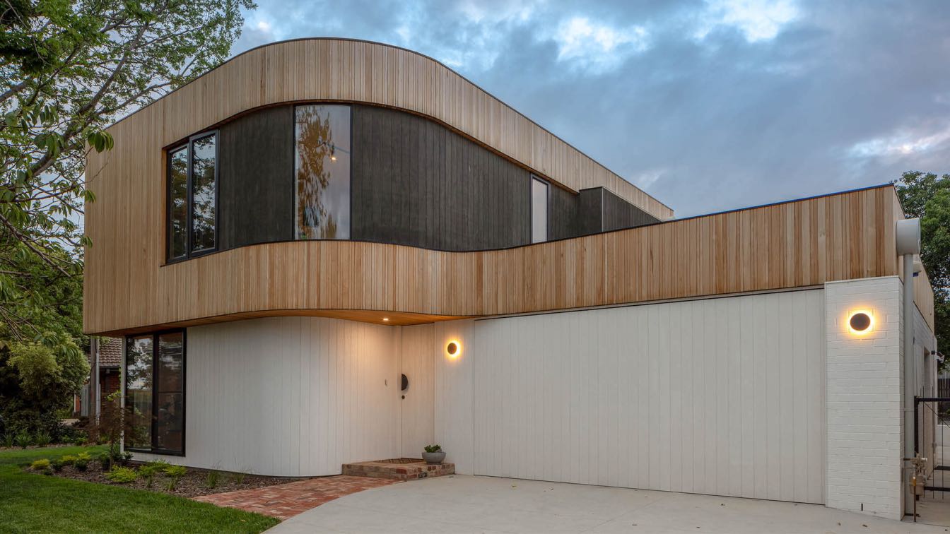
Rob Henry Architects: Situated on a leafy suburban site, the Ribbon House has been carefully wrapped around the existing established trees to enhance the indoor / outdoor connection. A mix of natural timber and white/black washed timber cladding reduces the scale of the two-storey form, peeling off in places, much like a ribbon on a box. This is a smart family home with modest detailing of beautiful materials.
What was the brief?
Whilst the initial brief was archetypal of a suburban family, the client’s different cultural backgrounds provided diversity of viewpoint on aesthetics and function. Bold contemporary forms would have to blend with audacious colours, textures and ornate trinkets.
 image © LightStudies Photography
What were the key challenges?
Respecting the existing landscape qualities of the site, Ribbon House wraps around significant trees and maximises connectivity with both front and rear gardens. To preserve outdoor space, the planning had to be over two levels; ground floor living areas and guest facilities for long term visitors, and first floor bedrooms.
What was the siting of the project like?
Located in a suburb undergoing rapid rejuvenation, Ribbon House deliberately contrasts with the neighbouring 60’s brick and tile cottages surrounding its leafy site. It is a statement of progression, without being overtly dominant or sinfully faux heritage; common languages of other new builds in the area.
 image © LightStudies Photography
How is the project unique?
The form is unapologetically contemporary, but is softened by subtle curves and enduring materials, textures and neutral tones. The ground floor materiality combines white painted brick and textured plywood sheet cladding, whilst the first floor is of vertical v grooved Silvertop Ash boards with black stained plywood insets. In order to blend the two levels together, the upper timber cladding peels off the façade and wraps the lower form, much like a ribbon on a present. The Silvertop Ash, left untreated to grey off over time, has been finely detailed with varied board widths in a regulated but textured pattern.
If one were to judge a book by its cover, this house would be typecast purely as ‘form driven’. However, the underlying truth is that careful planning to resolve difficult site constraints, regulatory setbacks and client expectations, has resulted in a home that enhances family living through connectivity, warmth and beauty.
 image © LightStudies Photography
What is the arrangement of spaces like?
The planning orients all living areas and the bedrooms towards north, maximises access from living areas to front and rear gardens, and separates public and private spaces by levels. The entry door, clad to match the exterior wall, opens into an east west gallery space with white painted recycled brick wall that runs through the building and back outside into the rear garden.
The main living area is separated from the kitchen and dining area by slatted timber screens with a central staircase to the first floor. A family room connects into the kitchen space and to both outdoor areas. The southern wing includes garaging, services, and a multi purpose space with northerly view into the deciduous trees.
On the upper level, a north south gallery provides ample storage and good separation between the parents and kids’ bedrooms. The bathrooms have glazed ceilings to filter light into the space whilst ensuring maximum privacy from neighbouring properties.
What are the interior spaces like?
The interior colour palette is predominantly white and Spotted Gum; a neutral base to allow the client’s possessions to take stage. A clear departure from this neutrality can be found in the main bedroom, where walls and joinery are adorned with a deep aqua marine blue.


